I am so proud that I’ve been keeping up with my resolutions to get back to scrapbooking AND post my non-DT projects to my blog. Now I’m posting TWO just today!
I’ve just recently found the Pagemaps website where Becky Fleck shares her wonderful sketches and holds her awesome challenges!
Here is the most recent sketch:
I love this sketch and I was automatically inspired to use a recently purchased Crate Paper collection pack Portrait Collection.
Here’s the thing - I really liked this sketch, but I only had big 12x12 papers in this collection pack and the thrifty girl in me could NOT cut into three or four big, beautiful papers to create those little banners. I HAD to come up with another alternative. So, I used one of my favorite tricks. This particular ‘trick’ is pretty much the top reason that I love collection packs.
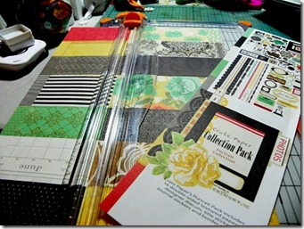
I gathered any and all potential supplies on my table:
As you can see, I didn’t end up using half of these supplies, but I’m a faster scrapper when I am surrounded by all that potential. : )
---------------------------------------------------------------------
I took the packaging from the front of the collection pack and cut the unwanted part from it:
BUT I will keep that part in case I want to use that pretty yellow rose!
----------------------------------------------------------------------
Then I cut the pretty part into strips:
I then used those strips to create the little banners and pieces that made up the majority of my layout. I LOVE doing this because it stretches my collection pack AND it’s very eco-friendly (which is hard to say in PAPER crafting, lol!)
And here is my final product:
I LOVE how those strips look! They were perfect for this layout!!
-------------------------------------------------------------------------------
Stamp: Stampendous | DSP: Cratepaper Portrait Collection; Glitz Design (damask) | Cardstock Stickers: Cratepaper Portrait Collection; Basic Grey Out of Print, June Bug (alpha) | Dimensional Sticker: Anna Griffin | Punch: EK Success Ledger Edger | Glimmer Mist Forest Green | Adhesive: Ad-tech
-------------------------------------------------------------------------------
PageMaps: Sketch
Make it Monday: Always Anything Goes
------------------------------------------------------------------------------
Thanks for stopping by!! Please let me know what you think of my collection pack banners! And, if you use any packaging – tell me what you use it for!!
And remember – it is so GOOD to be queen!!


Fantastic!!! LOVE your rendition of the sketch. All those elements just worked perfectly together. VERY, very pretty. :)
ReplyDeleteThank you for playing along with us at Make It Monday!
Remember, for a chance to win the prize from our sponsor, leave a comment for another entry and mention that you saw them on Make It Monday.
Lisa xx
Oh wow! This is awesome! You're so brave to cut into so many pieces of that beautiful paper, but that's what it's for right! Super layout! I am new to scrapbooking and doing it out of necessity right now, rather than a love for it, but perhaps the love will come later! Thanks for the inspiration.
ReplyDeleteThis is really pretty! I LOVE all the strips of ppaer and how you framed the photos! LOVELY colours too!
ReplyDeleteHugs,
Chris
This is truly beautiful. Love the layering of papers and the embellishments are yummy.
ReplyDeleteWow, this is a gorgeous lay out! Saw you at Make it Monday. ~Diane (I am #23)
ReplyDelete